
The shimmering bayside blue, soaring seagulls and the glowing skyline adorned with bright Boardwalk lights and roller-coasters. It’s a familiar sight that becomes exciting all over again every time visitors roll down the Rt. 90 Bridge on their way to Ocean City, Maryland. This natural sense of relaxation is the feeling the resort hopes to capture in its “Somewhere to Smile About” campaign, set to hit billboards and the airwaves in the new year.
Revealed at the end of October to an energized Performing Arts Center auditorium full of faces from across the tourism scene, the new branding’s debut comes after 15 months of planning by Tom Perlozzo, the town’s director of tourism and business development, along with BVK, an advertising agency.
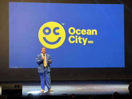
With a simple slogan, logo and the letters “OC,” Perlozzo, wearing a colorful suit decked out in the new brand, said it reflects the town’s message of carefree fun.
“The new logo is a universal symbol of happiness and joy. It’s contagious and transcends the language to a positive vibe,” Perlozzo said. “We wanted a consistent image and identity but we wanted the brand to speak for itself. I want everyone to see a smiley face and think of it as a shortcut to their happy place.”
By April, Perlozzo said to expect the rollout of several television commercials, social media content, traditional signs and a re-designed website.
Perlozzo prioritized streamlining the town’s identity through a new brand since taking on the role last year, making Ocean City a family-friendly destination year-round for all generations. He said he focused on people’s perception of the town and what’s driving them to visit.
Most recently, the resort used the “Ten Miles of Memories” moniker to attract visitors during the pandemic, though the campaign lacked a consistent logo such as the smiley face.
These changes come as Ocean City competes with other destinations, including Myrtle Beach and Disney, where Perlozzo said approximately a third of resort visitors also vacation.
While the smiley emoji, reminiscent of 1970s advertisements, capitalizes on positive feelings, Perlozzo said the decision to use it came from facts. The town conducted thousands of surveys and perception studies and also organized focus groups.
Still, some have voiced their sharp disapproval. While many support the slogan, naysayers criticize the logo’s simplicity, with some going as far to call it a waste of money. BVK’s initial bid for the advertising overhaul came at just under a million dollars.
Nearly four in five respondents said they are not fans of the smiley face in a survey released by OceanCity.com. While unscientific, the one-day online poll, which garnered more than 1,000 responses, revealed a common dissatisfaction with its simplicity.
“I don’t think it has the resonance to create brand loyalty,” one commenter said.
“It’s juvenile at best to represent our amazing town and community. The colors don’t mimic natural colors that should be seen in our environment to provide a calming effect,” another wrote.
Others indicated a preference for the wave design that has appeared in advertisements for years and encouraged the town to rely on local artists for alternative ideas.
On the contrary, it’s all smiles for Susan Jones, executive director of the Hotel-Motel-Restaurant Association, who said from a marketing perspective, this makes sense.
“I like the new logo since it evokes emotion. When people come to Ocean City, they are vacationing and who isn’t happy when they are going on vacation,” Jones said. “There were so many groups interviewed, and they all pointed to the easy-going vibe of our community. The smiley is something that businesses can incorporate into their marketing.… I’d love to see all the front-line staff and those in retail wearing the smiley button this coming season.”
To the naysayers, Perlozzo said he hopes they come around.
“We are a happy place and I think in the long-term, as people understand, it (the branding) will do better, but I’ll be honest and say not 100% of people like it,” he added. “It’s really simple, but I think only time will tell. The unique thing about the logo is it’s timeless… As time moves on, people will love it and we will embrace it as a town.”
I love the new logo. Why are there no stickers, magnets and other merchandise with the smiley logo?
That image is already outdated, obsolete. I would not be interested in wearing that logo on a T-shirt. It has a ‘chintzy’ feel to it. OC already has that look and feel to over come.
This is HORRENDOUS. Probably spent $15,000k on a crap logo. Nice job. This shows absolutely nothing that has to do with ocean city Maryland. “Somewhere to smile about” that doesn’t even make sense. Some place, something could have worked. This logo needs to go just like the mayor’s suit, in the trash. Create something better